

Lornie Agriculture
Lornie Ag is an agricultural firm grown in New Zealand. They were in need of new branding that was modern and conveyed strength and growth.
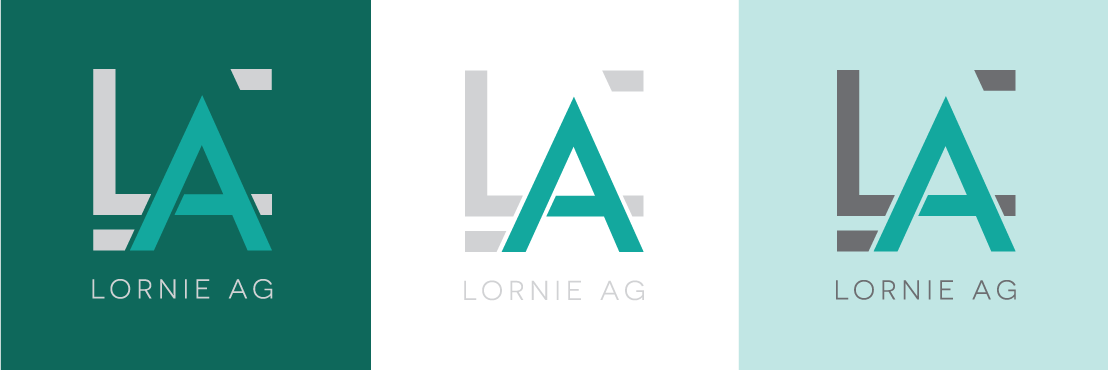
The Logo
The font was selected to convey strength, solidity and simplicity, while the colours picked express the modern feeling the firm was after. Beginning with a square, the shape was dismantled to indicate the firm having no bounds, and the corners suggest growth outwards. This idea was then stylised to create the final design.
There are three versions of the logo - the primary compact version, a secondary extended version, and the monogram. The monogram should never be used alone as a main logo, but can be used to compliment designs.
The Colours
Lornie Ag has four primary colours - a dark and light green and a dark and light grey. Black is also used for text, and white can be used to compliment the other primary colours. The middle tone green of the logo should never be used in any other application, being used solely for the A of the logo.